

Case Study
dooConsult is a Belgrade-based independent management and technology consultancy.
2023
Visual Identity
Brand Design
UI/UX Design
Website Development

Logo
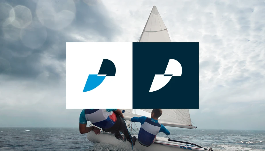
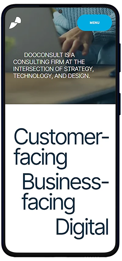
Everything brand identity-wise started with the logo. The logo is a visual representation of the rudder and the sail, which in turn represents business-facing and customer-facing processes and solutions, former “below the water” and latter “above the water”. The both parts of the logo are of the same surface, emphasizing the importance of the both.
The flat design and rather clean shapes of the two elements are also here to emphasize the importance of alignment between back-office and front-office processes and workforce. The elements are angled to emphasize the motion and steady direction.
Final but the most important part of the logo is the font itself. The founder started as a Microsoft specialist. It was so natural to pick the Ubuntu font. Why? To always remind people in the firm that they should only take on problems they have profound knowledge of. Running a consultancy can be a tricky job, it must affect a person who is tasked with the project that was not given to anyone in a 15K or even more strong organization. The Ubuntu font is here to serve as a permanent warning sign, dooConsult will only accept projects they are confident they can successfully complete.
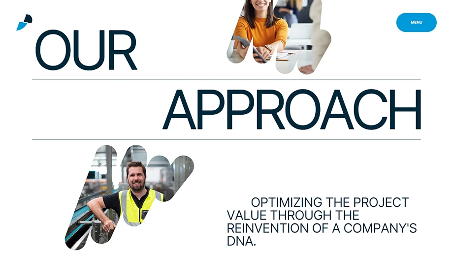
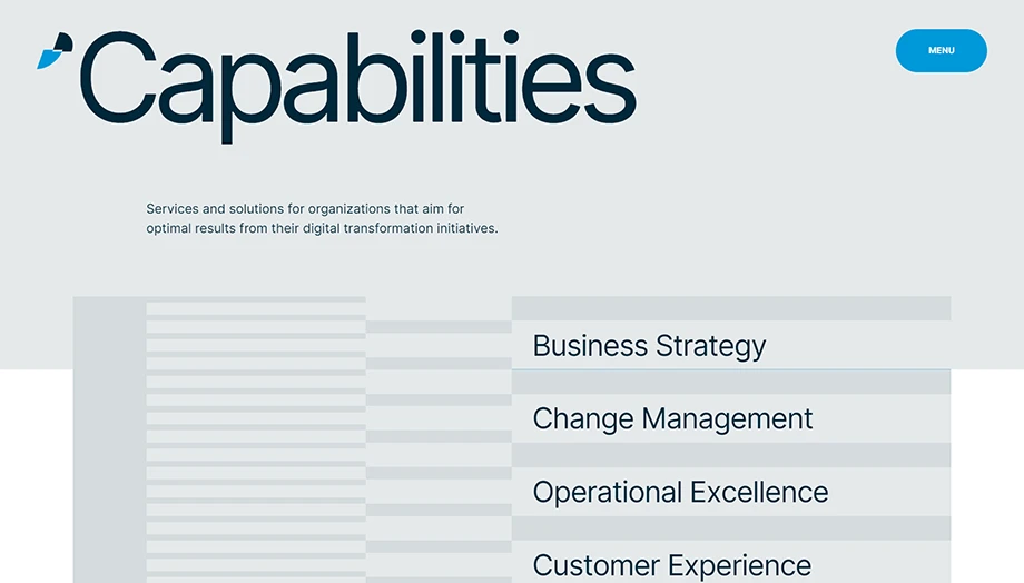
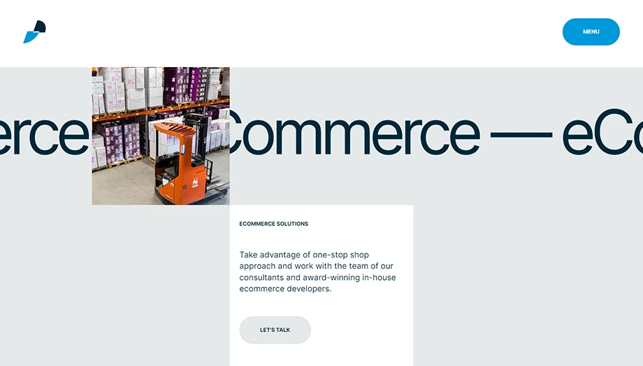
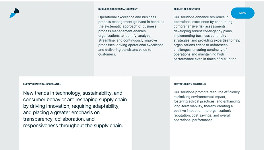
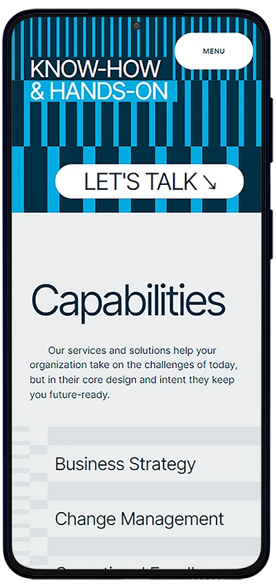
Focus on expertise areas
Throughout the website, the focus is on presentation of expertise areas and solutions in specific industries. Along with the challenges within each area, we’ve highlighted specific services and solutions.

Next Case